The newsletter creator is an easy tool, you can use to create responsive templates for mailing your newsletter.
![en_1_creator]()
[A] Layout – enables you to choose the structure of the new template. More than one structure can be added in one template.
[B] Widgets – elements used to add required editable fields into the structure.
[C] Social Buttons – social media icons, which can be added to the template and supplied with relevant links.
![en_4_creator]()
[D] Edit – with this feature you can return to template edition.
[E] Preview – provides you with on-going access to the final template view. You can also see what the template will look like on various devices.
![edit]()
[F] Clear – enables you to remove all structures and widgets added to the template.
[G] Save Email – use this feature to save your template and start creating the message.
[H] Page body properties – can be used to set colors for your template.
[H] PAGE BODY PROPERTIES
![kn_2]()
[H1] Background Image URL – paste an URL for the graphical content to be featured as the template background.
[H2] Background Color – use this feature to set background color for your template.
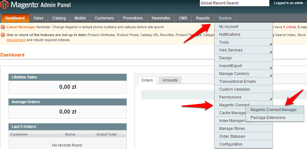
CHOICE OF COLORS:
option 1. enter color html code
option 2. click the html color code area to choose color from the color editor and confirm your choice by selecting a small colored circle
![kn_3]() [H3] Page width, where you set central message width with 600 pixels set as default. Generally, the best width for emails is between 600 and 680 px.
[H3] Page width, where you set central message width with 600 pixels set as default. Generally, the best width for emails is between 600 and 680 px.
[H4] Page Color – color setting for the central part of the email message.
[H5] Border Size – frame width for the central part of the email message.
[H6] Border Color – set the frame color.
Page body properties can be modified at any time.
[A] STRUCTURE – In order to select your preferred structure – drag it onto the central part of the template. Apart from selecting one, you can freely modify any chosen structure:
![kn_4]()
[A1] Column – here you can set:
- [A1a] color – additional color for a given column
- [A1b] border size
- [A1c] border size
![kn_5]()
[A2] add additional column to a structure
[A3] remove an entire structure
[A4] remove a column from a structure
[A5] move an entire structure to another location within the template
[A6] add an entirely new single structure
[B] WIDGETS – In order to select your preferred widget, you will need to drag it onto the central part of the column you have set.
![en_2_creator]()
[B1] Heading – supply headings/content titles/photos. Content editing like for text ( see B2 below) plus the emphasis function, enables you to select several text settings that will be compatible with basic button settings (see B7 below). This speeds up the process of editing your template.
![en_3_creator]()
[B2] Text
- [B2a] Align – feature used for setting text alignment (e.g. justified text)
- [B2b] Text editor
- [B2c] Custom fields – useful function for message personalisation. If email addresses in your database are supplied with the contacts’ first names, by selecting the ‚First Name’ option ($name.p1$) you can see the contact’s name (e.g. Kate) automatically imported to be displayed here.
![kn_9]()
[B3] Image – use this feature to paste preferred graphical content.
- [B3a] add graphics imported from your file or selected from a featured gallery
- [B3b] embed graphics by adding the URL of the site with the graphics
- [B3c] set graphics style
![kn_10]() [B4] Image + Text
[B4] Image + Text
[B5] Text+ Image
[B6] Divider – line that can separate e.g. two text fragments
- [B6a] color – change divider colour
- [B6b] stroke – change divider style
- [B6c] border size – set divider width
![kn_11]()
[B7] Button
- [B7a] Label – use this feature to edit button text.
- [B7b] Target URL – here you can paste the URL to which the user will be redirected to after clicking the button.
- [B7c] Style – allows you to set button colors, e.g. according to standard settings compatible with heading edition (see B1).
- [B7d] Style -> Custom – select this option to set the color scheme according to your preferences – the dialogue for button will appear.
- [B7e] Size – set button size.
- [B7f] Top Margin – set the margin above the button.
- [B7g] Border Radius – for rounded button borders you will need to set border radius. Enter ‚0’ for straight edges.
![kn_13_a]()
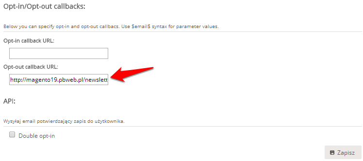
[B8] Opt-out message – every email must contain an opt-out link for opting out of receiving future messages. Clicking the opt-out link will result in changing the contact status from opt-in to opt-out.
REMEMBER! – to see the final view of your template you can use the PREVIEW option [E]. The edit view differs from the final view of the template. You cannot download the html code of the created template.
Template view during edition Template preview
![p12]()